Packaging + Products
A handful of the Packaging, Product Development and Naming I've enjoyed working on.


KidQuencher
KidQuencher wanted to create a unique hydration pack for kids with a squirt gun attachment. It encouraged kids to drink more and safely share with friends. I helped them with the backpack and gun product design along with creating the brand identity, surface pattern illustrations, and retail price tags.


PureCare Essentials
PureCare needed a new Sub-brand that highlighted their revolutionary technical textile silver coated bedding products. The conceptual brand imagery and copy highlights their unique cooling, cellular recovery, and temperature regulating fabrics. The women falling into REM sleep represent a deeper more healing sleep created by these textiles. The packaging system showcases the difference between each product and highlights the unique features of their pillows, sheets, and mattress protectors.


PURECARE ESSENTIALS PREMIUM SHEETS


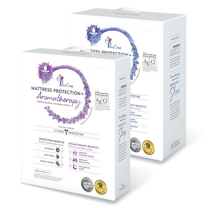
PureCare Technical Textile Mattress Protectors
PureCare's silver coated technical textile mattress protectors required packaging that visually showed the benefits of each product. The challenge was also how to fit the many different brand logos and names of individual products into a cohesive design grouping.


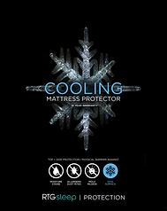
PureCare Premium Pillows
PureCare's silver coated technical textile pillows have unique properties of cooling, recovery and thermoregulation. Each needed a line with a name, a logo and packaging to distinguish one from another.

Celliant mineral infused recovery fibers are clinically tested to increase blood flow, improve recovery time and help the body thermo-regulate itself, promoting a better night’s sleep. Each of the Body Chemistry pillow packages feature a different active individual intermixed with minerals and flowing threads of energy.

Frio cooling fibers cool 5Xs faster than polyester and tunnel heat away from the body while you sleep. Each of the packages in this Sub-0 line was a different colour of blue with ice and snowflakes as unique as the pillows inside.

Tempsync paraffin based fibers change state from liquid to solid throughout the night to maintain a consistent and comfortable sleep temperature all night long. Each of the neutral toned packages in this thermoregulating line had a unique dripping of wax and sacred geometry with the colours representing the sweet spot between warm and cool.
SoftCell Pillow
PureCare made an amazing adjustable chambered pillow and needed a name and wordmark. The "o" in soft is made to represent one of the "cells" and for a cleaner airy feel the registration mark is incorporated into the type. I was fortunate to Name this pillow, create the logo, make the embroidered labels as well as packaging for multiple lines.


HYPERICON
HyperIkon needed a package design along with an app design for their new Smart Light Bulbs that were easily adjustable from your phone. I designed a package that was self explanatory, sharing the same visual as the app for consistency of recognition.


Revive
Revive needed a small 10ml bottle design for their collection of essential oils. I created a clear label with simple black illustrations so they could be seen through the bottle with the brand name and scent overlaid in different identifying colours.

8 Botanical Bliss

Botanical Bliss is a gin infused with 8 botanical plants and flowers from Juniper to lavender and rose. I created the label by collaging botanical illustrations while showing the individual elements on the back.


GotMilk Straws
GotMilk needed a little cow and some milkshake illustrations with a clear package to show their flavoured milk straws.
